Lightroom Overview - Part IV
Develop Module Basic Panel
When you open the Develop module the left side panel in Lightroom changes to offer you some presets. These will remain through the various tabs in the Develop module. They are simple processing options that give different looks to your image quickly. I suggest you use them as concepts of what your image might look like. As you move through them you can see in the various Develop module tabs the modifications that were made to create the look. This can be helpful to get you started in understanding what various modifications do to your image in terms of color and contrast. Most of the changes happen in the Basic panel or in the B&W panel. There are also "profile" changes that appear in the Basic panel which are available in the Browse section of the profile drop down.
Shortcuts
A couple of shortcut keys that are useful in the Develop module include the Tab key which toggles the visibility of the side panels. Add the shift key to include the top and bottom panels. The T key toggles the bottom Toolbar under the image. The \ key toggles the before and after view. The Spacebar toggles between the two views of the image you have set in the Navigator panel. The F key toggles the screen mode which either shows the regular view or a full screen view based on the Navigator setting. If the Navigator is set to "Fit" the image will present full screen. Be careful not to make certain judgments based on "Fit" as the image may be interpolated on the screen. In 1:1 in the Navigator the image will be seen at 100% and the F key will simple eliminate all of the distractions. Of course, there are dozens of other shortcuts available, some of which depend on the platform you work in.
Treatment

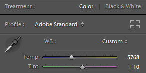
The top of the Basic panel says "Treatment" and defaults to color, but there is the option to change the image to Black and White. This changes the profile to monochrome. Changes in the B&W panel settings and in some cases to the Split Toning panel are shown if you choose from the left panel presets. If you choose to render a B&W image using Lightroom you should play with the B&W mix sliders to see how changes in how different colors are mapped to monochrome change the overall appearance of the image. If you are going to "Edit In" Photoshop I suggest you send a full color image as monochrome changes there are much more powerful.
The Profile of the image is set to an Adobe interpretation of the color as reverse engineered by Adobe from the camera raw file. There are options which will change the appearance of the image. Adobe Color and Adobe Standard are pretty vanilla. Adobe Landscape tends to enhance blues and greens while Adobe Portrait enhances yellows and reds. Adobe Vivid tends to add saturation to all colors but none of the profiles are radical departures. I tend to stick with Adobe Standard and make my own decisions about color modifications once I have established a basic neutral balance.
The panel includes the White Balance eyedropper tool which balances the entire image based on the point in the image you choose to render as neutral. I suggest using this as an initial color adjustment as it renders everything neutral in color temperature and tint. From there you can modify the temperature and tint sliders to creatively adjust the image to your taste. However, there is also the white balance (WB) option to the right which sets the color automatically or shows custom if you used the eyedropper. Clicking on various points in an image can change the color significantly based on the relationship of the colors in the image to the point you chose to render as neutral. For a true neutral you would click on something you want to appear as a shade of gray such as a white blouse, or clouds in the sky. You drag the eyedropper onto the image and click. Other options include balancing for the light source color such as Daylight, Cloudy, Tungsten and others. The default is "As Shot" respecting the color captured by the camera according to the image metadata.
Tone Controls

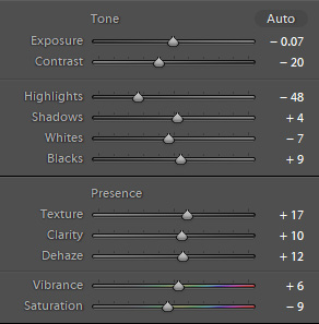
The most important part of the Basic panel is the primary adjustments to overall image tonality. The Tone section is broken down into a series of controls which affect different aspects of the image. Adobe positioned the sliders in the order they think you should make changes to your images. At the beginning of your experience this is fine, but there are reasons to do things differently as you discover the effects of the sliders. In addition to the controls themselves, corrections can be made by dragging within the histogram which is broken into area matching the Tone controls with the exception of contrast.
Exposure - modifies the overall brightness of the image. This is not the same as changing how you exposed the image in the camera, but the visual result is similar. You simply make the image brighter or darker. This is based on the midtones or overall impression of the image reality. In the histogram this is represented as the larger center section.
Contrast - modifies the image contrast while attempting to avoid changes to the black and white point. The middle tone values are expanded or contracted relative to the center point of brightness set by Exposure. If overall contrast modification are in order, this is the easiest control to use. Otherwise changes to shadows and highlights will offer more limited control to those areas. In some cases a combination of the controls is a good solution making an overall adjustment first and then fine tuning the shadows and highlights. I typically use the Contrast slider minimally preferring the highlight and shadow sliders in conjunction with Clarity to massage the image contrast.
Highlights - modifies the relationship of highlight values to the overall image. Minimal changes are made to middle and quarter tone values as highlight values are reduced or expanded. The further down the brightness range toward the midtones the greater the percentage of change. This essentially expands or contracts the contrast of the top half of the image values. The white point is maintained in lowering values but small highlights can be pushed into clipping so the white point may have to be revisited. Reclaiming cloud detail and other important high values such as lighter toned clothing can be done quite well in conjunction with slight changes in Clarity. The Alt/Option keys can be used to check the white point.
Shadows - modifies the relationship of shadow values to the overall image. Minimal changes are made to middle and three quarter tones in a manner similar to what the highlight slider does. Black point is maintained while raising shadow detail, but can be significantly lowered if shadows are reduced. Revisit the black point if reducing shadow values. The Alt/Option keys can be used to check the black point.
Whites - sets the white point clipping. Use the Alt/Option key to see the point at which information appears on the screen indicating clipping. If the brightest part of the image is not a specular highlight there should be no indications on the screen. If the brightest part of the image should be below 255 it may be necessary to set an even lower White value. Lightroom does not have samplers available like ACR so it is necessary to move your cursor over important bright areas and check the target values in the histogram. This is mostly as Lightroom does not establish a color space for your file until export or printing and values cannot be absolute. Image sharpening can raise the white point, as can export to a jpg.
Blacks - sets the black point clipping. Use the Alt/Option key to see the point at which information appears on the screen indicating clipping. Black points are less absolute than white points in that clipping is less bothersome to some photographers. I typically set the black point considerably higher than the clipping point to avoid loss of shadow detail, but knowing where the best point should be depends on printing intentions and/or intent to process in Photoshop. Ultimately image sharpening can push the black point down as can export to jpg.
Presence Controls

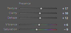
The bottom section is Presence which is essentially the overall impact of the image. There are five sliders in the most recent version: Texture, Clarity, Dehaze, Vibrance, and Saturation. The first three work as a team to control the appearance of fine detail in the image by controlling contrast. The best results will come from a balance of settings between the three sliders.
The Texture slider is a more subtle contrast control than Clarity. In that respect Texture will enhance middle value texture in a slightly more realistic fashion. It deals with medium sized details rather than fine details. The texture slider has a minimal affect on luminance and saturation. While it may not be intuitive to use a slider called "Texture" for portraits, one of the intentions of the design was to manage skin smoothing in a controlled manner. Lowering the texture setting can smooth skin tones without reducing fine detail. Increasing the texture setting can enhance landscape or architectural details with a minimal enhancement of noise.
Clarity increases contrast with attention to edges which makes it a bit more intense in its affect. It essentially enhances midtone contrast, and has a greater affect on luminosity and saturation than the texture slider. Clarity makes greater changes to a broader range of frequencies than texture. This is particularly noticeable in darker tonal values.
Dehaze looks at the way light is captured in relation to atmospheric dispersion and the effect that has on the image. The filter tends to adjust darker tones in relation to lighter tones and the result is an increase in contrast that appears to remove atmospheric haze. Negative values can have the effect of increasing the appearance of haze. It is easy to overdo the effect.
Vibrance and Saturation are another pair of controls that can work together. Their individual effects on an image can be noticeably different. Saturation simply increases the overall intensity of color values in the image. This can result in oversaturation of some values as there is no protection for colors that may have been saturated in the first place. Vibrance has a stronger effect on less saturated tones. This has value in that Vibrance will tend not to over emphasize skin tones as Saturation might. It can be valuable to use them together to massage the color in an image.