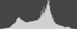
Histogram
Using the Histogram to Assist in Processing
The histogram is a visual representation of the tones in the image. The left end is the blacks and shadows, the right end is the whites and highlights. In the original camera capture in raw files the histogram may not fill the entire width. In a camera processed image the tones may more fully fill the width as that is one of the functions of the processed jpg. It is also one of the reasons we get incomplete or misleading information from the image preview on the camera. We are not looking at the raw file.
One way to get more valuable information from the camera jpg is to set your preferences to show a flatter image. Lowering the contrast and sharpening settings in the camera will temper the jpg preview image giving you a more realistic interpretation of the capture. Since those settings have no affect on the raw file they are only important to you if you intend to use the camera jpgs themselves.
In most images the final image should encompass the full width of the histogram providing the image should contain the full range of tonal values. At the same time, the histogram display should not show peaks at either end that create a wall. This would indicate that clipping has occurred.
With this in mind, we can use the histogram to help determine where some of the weak spots are in the image and what needs to be done to correct them. A low contrast, bright image will have few if any indications of tones in the bottom end of the tonal range. A low contrast dark image will be missing tones at the right of the histogram, which may indicate underexposure. Understanding the linear nature of a raw file will help you with the concept of raw file exposure.
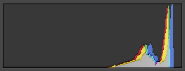
We should prefer the histogram with tones more to the right end as the linear nature of digital capture means that more information (detail) is available. Extending the histogram to the left to increase overall contrast is easy and less destructive. In other words, making things darker does less damage to an image than making them lighter. This is the concept of ETTR or expose to the right. Underexposure eliminates available detail. A one stop underexposed raw image has lost half of the potential information of a properly exposed capture. The histogram to the right shows a properly exposed image with high values but no bright whites. The image is flat with little or no detail below a midtone, and no blacks.
Looking at the histogram of a low contrast image with missing dark tones it is easy to move the black slider to stretch out the tones and give contrast to the image. When you do this you are mapping areas of more tones down to areas of the image that would normally have fewer tones, so there is no loss of information or creation of noise.
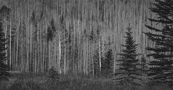
Use the clipping indicator to avoid clipping the blacks, and once you see where the darkest points are you can set a desired black point. It is not necessary to make the darkest part of the image reach zero. If you are printing the image you will need to know at what point an image will print visual black without dragging shadow tones down excessively. In the image of the river the darkest tones may be well short of a true black.
Use the white slider to set the high values to an appropriate level without clipping the whites. This will vary with images depending on the desired tonal values of the brightest areas. Specular highlights like light sources may reach pure white (255 in RGB) but most whites will be lower in order to create detail in bright areas. If the subject is white in color, but not in brightness, you will find lower numbers are better. You should learn to understand how bright a value can be and still separate from a specular white. This value may be different depending on how the image will be presented. A monitor displayed image may present itself differently than a printed image. Usually it is safer to process for the print as an image viewed on a monitor can be more subjective.
I prefer to start processing an image at the bottom of the dialog rather than the top. I use exposure as the last correction rather than the first. The exposure slider controls the overall brightness of an image in processing and is different than a change in exposure in the camera, which moves all values. In that respect the term “exposure” for the processing slider is a bit misleading. There is no viable alternative to the naming of the tool as “exposure” makes the most sense to most users.
The RGB values in Lightroom are expressed as percentages rather than specific numbers as they do in Adobe Camera Raw. This is because an image in Lightroom has not been defined relative to a color space. In ACR the destination color space is assumed. The numbers may change as a Lightroom image is exported to Photoshop in a particular color space such as Adobe RGB or sRGB. This can be an advantage as you are not dealing with the color space to start, but you should be aware of the intended destination. This is mostly a matter of experience.
The saturation of colors in Lightroom are vastly greater than the ability of an sRGB image to manage. They are closer to the ProPhoto color space. Fortunately for us, most of the out of gamut colors of a converted color space are managed by Lightroom when we establish the destination color space. In some cases you can see a shift in the colors and saturation if the original image contains a wide range of colors. Most images will not exhibit a radical change, if any. If you work in Photoshop and use Convert to Profile with Preview on you can see when an image changes as a result of the output color space. Since you are exporting the image from Lightroom you do not have the luxury of the preview and may not notice the changes as most are very subtle.
Once the black and white end points of the image are established, the shadow and highlight sliders allow you to modify the image to move toward your intended outcome. At this point you can use the Exposure (Gamma) slider to make the image overall brighter or darker. The Contrast slider can control the overall contrast of the image. In most cases these moves need to be subtle rather than radical.
In the Presence area of the Basic panel are three sliders that also have an impact on the overall image contrast and apparent sharpness. I suggest using them with the image at 100% so you are looking at actual pixels and not an interpreted image. The effect of the Texture and Clarity sliders will vary somewhat based on the content of the image. Both of them affect the visual contrast of the image.
Clarity expands or contracts the contrast of the midtones by changing the relative differences in adjacent tonal values. Changes are stronger in the middle values but the black and white points can be pushed to clipping if overdone. Observe the changes as you modify the Texture slider as well to determine how far to go.
The Texture slider is Clarity with a preference for high frequency differences, meaning the places in the image where greater differences in contrast are already higher. These are areas of fine detail as opposed to areas of broad tone. You will see a greater expansion of highlight values with the Texture slider than with Clarity, but the differences can be subtle. Therefore it is necessary to play with the two to determine the better choice based on image content.
The Dehaze slider has a greater influence on darker values, and as you make changes you can easily see the middle and left side of the histogram move. Increasing values adds contrast without raising the higher values. Decreasing values lowers contrast by brightening shadows. This affects the global image contrast, but has a greater influence on the darker tones while the Contrast slider changes both ends of the histogram. To determine the best influence on the image contrast you may need to work with both Contrast and Dehaze.
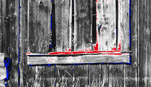
As you work with the sliders you may have to return to the Blacks and Whites sliders to be sure that the endpoints have not been pushed into clipping. Right click in the Histogram to get the option to show Clipping and the Indicators. Showing clipping is where the highlights turn red and the shadows turn blue in the image. The indicators are the boxes at the top of the histogram that light up when you clip. The indicators will sometimes light up before the clipping color indications. You want to avoid clipping altogether as it will rob the image of detail. It is also possible to clip individual channels which may cause unwanted color shifts. This would only be seen if you could monitor the channels as you change settings. I find it unfortunate that Lightroom does not offer positionable probes as ACR does. Even with the limitation of percentages rather than absolute values it is not possible to monitor a specific point in the image unless you use the arrow keys and leave the cursor in position.
It can take a while to get used to highlight and shadow values that are not excessive. Higher than necessary white values rob the image of important detail. A white flower, dress, or shirt will show detail at values in the range of 90% in Lightroom or the mid 230s in ACR. You need to carefully evaluate the image tones to determine where highlights should appear as opposed to detailed areas of light color. The alt key in Windows or the Option key in Mac allow you to visually see the area being clipped as you move the sliders. My preference is to identify those areas and then look to see how important they are to the image in order to process them logically. This normally sets whites and blacks well short of clipping.
If you place the cursor on a point in the image and view the numbers in the histogram you can see whether or not the tone at that point is neutral. Numbers that are not the same or very close indicate a shift in the direction of the higher values. If the B numbers are higher than the R and G there is more blue in the image at that point. Normally you want a true black area to be neutral as you would a white area. While this is not always true it is a good starting point for most processing. I usually do a neutral (white) balance first on an image. Then you can deviate from that point if you desire a color balance other than neutral, but you have a clean starting point.
White balancing an image has some advantages. While shifts in temperature are common (too blue or too yellow) it is possible for images with primarily ambient light sources to have a tint shift as well. This is a slight green or magenta tint that can be very difficult to discern by eye, and even harder to fix by manipulating sliders. The eyedropper tool is your friend here as it finds the neutral point automatically as part of how it functions and eliminates tint shifts. In some images a tint shift may be part of the desired color, such as magentas in sunrise and sunset images.
While it is normally preferred to set a white balance on a brighter area, it is possible to set a balance on any point in the image. When you activate the eyedropper and place the cursor on a point in the image you see a grid indicating the precise point of the cursor and an enlarged view of the image showing adjacent pixels. This makes it easy to pinpoint a precise location for setting the white point. At the same time you can see the RGB values at the bottom of the grid and get an indication of how close those values are. Whether or not you set the balance at this point it is a useful tool for analyzing image color. A precise match is not necessary especially if the area you are viewing is not intended to be neutral. In this way you can determine color and tint shifts in selected areas of the image if the need arises. Obviously, if the area is a distinct color, the numbers will reflect the values relative to that color. This can be a good way to learn how colors work in images.
In the shadows an image may print pure black at values in the range of five to seven percent in Lightroom or numbers between 12 and 15 in ACR. There may be points in an image that reach zero in the same way that specular values in an image will exceed important highlights. That differentiation is something that takes a while to become used to as we tend to look for the darkest point in an image, rather than the darkest important value. The black hole in an area where there is no light at all will be logically darker than an area of deep shadow in a part of the image that is lit. Dragging the dark values in an image lower than necessary simply robs the image of shadow detail that might otherwise be of visual value.