Composition
"[Photography]... has little to do with the things you see, and everything to do with the way you see them." - Elliot Erwitt
Composition and the Brain
Composition is the structure of an image, the flow of the eye through the image, and the balance of visual elements. Artistic design displays order, balance, and harmony in the image. The basic concepts of composition can be taught, but are as much a matter of experience as education. Visualizing, or learning to see is a matter of practice. It is a conscious exercise. Looking at images and analyzing them are different in the manner in which they affect perception.
It is no surprise that many of the most successful photographers studied classical art. As beginning photographers we often do not spend enough time looking at images beyond what daily life provides. Images in magazines and calendars are different than fine art. Images in magazines have an agenda; advertising or editorial, they are intended to elicit a response based on their content to influence how we think or what we buy. They are not intended to teach us to see. At the same time, they are often valuable as they can be good story tellers, as advertising is meant to be. They can lead us to see what the photographer wants us to see. How the eye moves through any image is a lesson.
The brain functions on two levels controlled by the right and left hemispheres. The left hemisphere controls speech and language, recognizes objects, and draws conclusions based on facts and reason. We communicate verbally using the left side of the brain. The right side of the brain is where spacial awareness, recognition of pattern and structure, and the understanding of metaphoric relationships resides. As we are schooled, we are encouraged to communicate with words rather than images, and to relate to things in a logical rather than a visceral manner. This exercises the left brain, and suppresses the natural creativity of the right brain. To be creative we need to learn how to tap into the resources of the right brain.
You need to train yourself to feel structure, balance and movement as much as to simply see them. This is why it is important to look at images. It is important to look at good images; great images; images that exceed our current ability; images that push us to higher levels of creativity. Mediocrity is contagious. Your goal must exceed your grasp. You must convince yourself to not only be the best you can be, but to learn how to be better than you are.
“Now to consult the rules of composition before making a picture is a little like consulting the law of gravity before going for a walk. Such rules and laws are deduced from the accomplished fact; they are the products of reflection.” – Edward Weston
Concepts of Composition
The concepts of composition are derived from observations of nature and the success of images that emulate nature in their design. Design in nature has a certain order about it, and our brains are naturally wired to recognize and appreciate those relationships. The Egyptian pyramids are a prime example of mathematical balance. The Greeks analyzed composition and understood the relationship between the height and width of images and the space within them. The Greeks and Italians were good at analyzing nature mathematically and applying their studies to various aspects of life, like architecture, sculpture, and painting. Mathematics was simply the means of communicating the concepts.
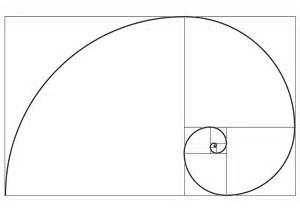
If you examine nature you find Fibonacci numbers (0 and 1 and each subsequent number is the sum of the previous two), and a variety of terms derived from them; the Golden Mean, the Golden Section, the Golden Rectangle, the Golden Spiral, etc. They are mathematical representations of natural patterns that comprise the everything; galaxies, conch shells, sunflowers, trees and leaves. They are essentially the mathematical explanation for the patterns in nature. They may be interesting to explore for a few moments on a rainy day, but the intellectual exercise can be boiled down to a simple concept. We intuitively recognize composition based upon the visual clues that nature provides for us. Over the centuries art has used this natural composition as it represents successful balance in visual media, whether it be painting, sculpture, or photography. We like what we see when the visual clues in an image follow the rules of nature and the balance it provides.

The image of a sailboat on the water with the boat positioned in the upper right based on the rule of thirds. If you roll over the image the crop changes and the boat position changes to the upper right of the Golden Ratio. Which do you prefer? The point is simple, the decision should be made on the result that is most satisfactory to the maker of the image. If the maker chose to ignore either cropping guideline that would also be acceptable providing the end result was pleasant to the eye so far as the balance of the image is concerned. In this image there is another important concept; negative space. The mood or atmosphere of the image, the vast space the boat lives in, is defined by the space around the boat as much as the position it is in. Sometimes empty space is simply empty space and can be irrelevant, and sometimes it defines the statement. How much space does the boat need to successfully make the point the artist intends to make?
The "rule of thirds" breaks the image into 9 equal areas and assumes the primary position of the subject or center of attention will fall in the areas where the lines intersect. The Golden Ratio is based on the division of space that follows the Fibonacci spiral and the spacial relationship is closer to 60/40. Neither can be considered "correct" or "incorrect" as they should be derived from the art, not imposed upon it. My perspective on the rule of thirds is an overly simplified method loosely based on image analysis intended to be an easy way for a beginner to learn composition. As such, it should be understood and abandoned as quickly as possible in favor of more sophisticated methods. In the image of the boat on the water above imposing the rule of thirds on the position of the boat diminishes the strength of the movement of the boat into the image and creates an excess of negative space that is unnecessary. Essentially, any imposed rule on an image removes the opportunity for the artist to decide how the image should be seen or felt.
Using the Crop Tools
The crop tools in Lightroom and Photoshop have a number of overlays available to assist in analyzing the balance of your composition. In addition to the thirds and golden rectangle divisions are the golden spiral and the golden triangle. The triangle and spiral guides can be rotated in orientation. These are handy guides to assist you in analyzing your composition decisions while using the crop tool. The positioning of the guides will change as the aspect ratio of the image change. As this happens some of the intersecting points may fall into the thirds position or into the golden rectangle position, or neither. This illustrates how the composition points are really analysis rather than hard and fast rules to be followed.
You should use the crop tool to explore balance in your composition and to help you eliminate unnecessary image content. In Photoshop you can choose either Ratio or WxHxResolution, but click the Clear box to the right to remove any imposition of specific parameters. In Lightroom simply click the lock icon to unlock any presets and allow unconstrained cropping. With the lock engaged aspect ratios can be selected. In both programs the overlays can be changed with the O key. The orientation of the triangle and spiral overlays in Photoshop can be changed by adding the Shift key to the O toggle. The spiral overlay does not appear in Lightroom, but an overlay for cropping to specific image ratios does appear which is not in Photoshop as the tool there can be set in other ways.
Formal/Informal Composition
There is also the consideration of formal vs. informal composition; symmetry vs. asymmetry. Symmetry is when a subject sits so that the left and right sides (or top and bottom) of the image mirror or balance each other. When this happens and the center line is not accurately centered it sets up a tension that cries to be resolved. For this reason, if you have an image that tends to want to be symmetrical and centered, you should take efforts to make sure it is accurately done. The visual pull of a line in an image to be near an asymmetrical point is not nearly as strong as the pull of a line to be dead center if it is close to already being there. In an asymmetrical or informal composition the primary lines are not centered but closer to the off-center points. Most images tend to be asymmetrical.
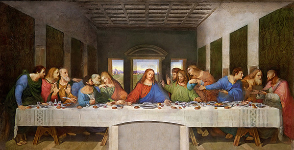
Davinci's The Last Supper is especially interesting as it is formal and symmetrical with respect to the overall composition, with a centered subject, while incorporating the Golden Mean for the supporting elements of the composition, which are asymmetrical. It is no wonder it is considered to be "perfect" when it comes to composition. Compositions are often complex, which can make them especially interesting.
A centered subject tends to be static rather than dynamic, but a static composition may be the intention of the artist. In addition to static, the centered subject feels grounded and secure. As you look at the painting Christ appears calm and settled while the figures on either side are dynamic. The symmetry of the building helps establish the foundation of the composition.
A subject usually has a natural balance point and that will find visual rest near a compositional sweet spot. Most subject matter sits in an area rather than at a point. Most artists will tell you that where the subject needs to be is felt more than reasoned. If that balance point sits in an unusual location but feels right, it must be right. The "rules" are acquired through analysis. Therefore they are not compulsory. They are guidelines.
In addition to the intersections themselves being sweet spots, the divisions are places within the composition where primary lines, like horizons and such, tend to want to be. While this is interesting and often true, there are many reasons why this is a rule begging to be broken, and the complexities of the composition of any image can overrule this positioning. If you work too hard to specifically place a particular line in a specific location you can cheat yourself out of interesting and compelling compositional choices.
Your goal as an image maker is to become comfortable with the concept of composition to the point where rules are not an issue, but a natural result of analyzing your images. Cropping images then becomes an instinctive tool which you apply while feeling how the elements balance themselves rather than whether or not you follow the rules. When you work this way you may find some of your images fall outside of the bounds of the rules, but still sit comfortably within the frame.
One of the advantages of the digital processing tools is the opportunity to work with a dynamic cropping tool so you can play with composition and instantly see and feel the results of your decisions. The more you refine your vision, the more satisfying even the simplest images can be. In Photoshop's crop tool, once you make a crop you can turn on an overlay which will place lines over the image to assist you in analyzing your decisions. It can be very helpful if the composition of an image is difficult, which can happen in both simple and very complex images.
SYMMETRY
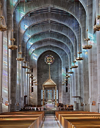
The cathedral image is naturally symmetrical as the building was designed and built that way. If photographed away from the center line you should go far enough away to create an obviously asymmetrical balance to the composition. Otherwise, you should carefully adjust the natural center line to satisfy the formal balance of the composition. Both horizontal and vertical convergence are removed. The symmetry is obvious, and the image satisfies the brain as the elements are properly aligned. Care should be taken in an image with obvious vertical and horizontal lines to remove pincushion or barrel distortion. Both Adobe Camera Raw (ACR), Lightroom and other editing programs have tools for this purpose. For most current cameras and lenses it is automatic, but may not be on by default.
The leading lines in the image draw your attention to certain areas regardless of their relationship to the borders. Only the base of the gold structure over the altar sits at a point defined by a rule of thirds or other specific compositional target. While the left and right of the image mirror one another creating the horizontal symmetry, the low position of the camera creates an assymetrical view of the vertical space. It is interesting to note how the light from the very high stained glass windows plays against the far walls in a non-symmetrical counterpoint to the structural symmetry of the overall image.
A common problem with some images is a symmetrical subject which is not carefully aligned. This will throw the image out of balance, and while it may be a subtle mistake it is one that will make an image "unsettling" to viewers. Training yourself to see symmetry and using the crop tool and other methods of correcting the balance in your images will make your results more satisfying.
Feeling balance - positive and negative space
"The place occupied by the figures or objects, the empty spaces around them, the proportions, everything plays a part." - Henri Matisse
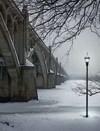
In this image of the bridge the leading lines of a typical asymmetrical composition lead your eye to a vanishing point. The entire space occupied by the light standard, the bridge abutment and the horizon line are a larger compositional element. A balanced composition often relies on complex interactions between elements in the image rather than on a single subject element. Several triangular shapes divide the image in ways that serve as balance. The negative space between the bridge and the lamppost are a tension point.
If the lightness of the snow in the central river area continued to the bottom of the image the sense of a base or support would be missing, so the shadowed snow tones contribute to the balance. The visual weight of the large bridge abutment on the left is the balance point around which the entire image is anchored. The space between the elements is the negative space that becomes an element of its own in composition. This is where learning to feel composition becomes necessary because no set of rules or guidelines in a camera viewfinder or a Photoshop tool will guarantee you that the image you make will work visually. Only your sense of balance and the experience of seeing many images will make that happen.
Focal Points
Most compositions have a natural focal point as most images are of a subject against a background. In an abstract image the focal point may be simply where the eye tends to land or move based on leading lines and the flow in the image. In some images there may not be a defined focal point. If the image has no compositional structure this can be uncomfortable as there is no center of interest to satisfy the mind. The left side of the brain instinctively searches for a recognizable subject. The right side doesn't much care, but still demands satisfaction in composition.
In abstracts and some landscape images there may not be a distinct focal point. The entire image becomes the subject but there must be sufficient compositional structure to satisfy. Sometimes in landscapes the structure is more implied than anchored with a piece of reality. Even the occasional Ansel Adams image finds this resolve. A number of contemporary minimalist photographers produce abstract "landscape" images that simply stand as a whole. The important thing is not the subject or the technique but the result.
Moving the Eye
The eye moves through an image from light to dark. Brighter areas get your attention first. Contrast, including color contrast (saturation) also lead the eye, with more saturated color getting more attention. This is not an invitation to over saturate color, but diminishing saturation in areas of less interest is a useful tool. The eye is attracted to sharp images and less so to softer areas, so selective sharpening can be useful in controlling where someone looks in your image. This does not have to be radical as the eye is pretty discerning. Extremely limited depth of field is one example of a radical difference that may be quite legitimate. This is common in portrait photography, flower photography and macro images. Less so in landscapes which tend to vast areas of acceptably sharp rendering. Only a single point of focus establishes a plane of sharpness and all other areas are less sharp. Acceptably sharp depends on many things including the size of the image, and the viewing distance. Special techniques like focus stacking can overcome the natural physics of the photography process.