Photoshop - Color Settings
If you do not understand the concept of color spaces you should first read my article on digital color under the Digital Foundations section of my learning page.
Color Settings are pretty straight forward. If you set up your color settings like the illustration you can't go wrong. The concept is simple: make things work as easily as possible without having to deal with conversions unless a warning shows up. Setting Photoshop up to warn you of potential problems is easy.
Working Spaces
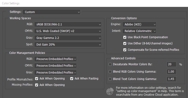
Unless you are working in a larger color space like AdobeRGB or Prophoto you are best with sRGB as your RGB working space. All current monitors are capable of fully displaying the sRGB color space, and any outside printing sources will have no problem with an sRGB file. If you are printing on your own you may want to consider the larger AdobeRGB color space, but this setting will respect any incoming image that is already in a larger space coming out of Lightroom or ACR as the "Preserve Embedded Profiles" setting for RGB color management is chosen. This simply means that incoming images will respect their source profile rather than being converted to the working profile. This can be important when working with incoming files from Lightroom or ACR in larger color spaces than sRGB as you do not want to accidentally reduce the colors in the file.
The CMYK and Spot management are both irrelevant for our purposes unless you use offset printing. Setting the Gray space to Gamma 2.2 is the most appropriate setting for most purposes. There is an sGray setting currently available which is ideal for the sRGB color space, but the differences are very minor. The Gray gamma has more to do with masking than it does with grayscale images which should be processed in RGB anyway.
Color Management
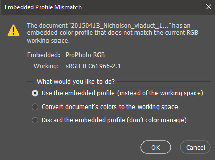
Preserving Embedded Profiles is always the best way to import images. Profile Mismatches and Missing Profiles are questioned so you can control the process. When you open a file that has a larger color space than sRGB (such as a file from Lightroom where your preferences are set to send files to Photoshop in the AdobeRGB color space) you will face a dialog noting the mismatched color space and asking you what you want to do. You can simply click OK to preserve the larger color space or change the option to Convert the document's color to the working space. This would be done if you intend to use the file in sRGB. Discarding the embedded profile (don't color manage) is not recommended. Images without a color profile may not present as expected, possibly with color shifts or oversaturation, overly bright, or other deviations from the desired intent. Some programs such as email clients will accept images without a color profile and "assume" the profile to be sRGB. In doing so they essentially "assign" the sRGB color space to the image and it renders correctly. Any other program that deals with image color profiles may have issues with properly rendering the image.
Images from the web are a prime example of the color profile issue. If you import a jpg found on the web that has no color profile attached a warning dialog will appear stating that the image has no embedded RGB profile. Your options will be to Leave the image as is, or to assign the working sRGB color profile which is usually the best option. There is also the option to assign another profile to the image. If you choose to assign another profile you will be presented with a long list of profiles depending on what is installed on your computer, especially if you have a color printer installed. Some images with an unusual profile will render properly, and some may not. It depends on how closely the image profile matches the sRGB profile. Images you are creating should not have issues. Keep it simple.
Under Conversion Options the Intent is set to Relative Colorimetric. This is the most accurate option as colors are mapped from the source destination to as closely as possible match the output based on the profiles used. Another option for some is Perceptual as it renders colors as closely as possible to the relationship of colors in the source. However, when colors are outside of the gamut of the destination source a shift in the colors may occur which may not accurately represent the source colors. If you are not overly concerned with color accuracy compared to the visual appearance of the image Perceptual is an acceptable option.
When you mouse over any of the settings in the dialog an explanation will appear in the Description box at the bottom of the dialog. This will hep you with any details you may not understand. You can save the settings and add a comment for them which is particularly useful if you have more than one setting for different purposes such as printing or the web.