Digital Color
Understanding Color
Color is a perception in the brain that results from the source of illumination and the reflectance of that source from the surface of an object. Color is normally described with three attributes, hue, saturation, and brightness. The hue is the the actual color as it appears on a color wheel with red at one end of the visible spectrum and violet at the other. As color transitions through the wheel it changes based on the interaction of the adjacent color and transforms into the millions of shades we perceive. The eye can perceive only a small range of frequencies. Longer wavelengths eventually become those we can hear. Shorter wavelengths include x-rays.
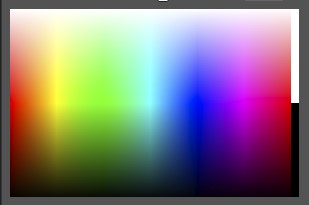
Saturation is the purity of the color, or the color without the influence of black or white to dilute it. In the RGB color spectrum display in Photoshop we see the division between black and white at the right. The mid point of the colors is where the saturation is greatest and therefore the color most pure. As we add either white or black to the hue we desaturate the color. If we add white we create pastel colors. Unfortunately, there is no similar single word to describe colors with added black. The saturation of a color has an influence on how we perceive the color in emotional terms and is one of the tools used by artists to manage their images.
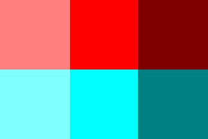
Brightness, or value, is the hardest attribute to describe in words as the visual impact of a color is an interaction between its brightness and its saturation. As a color gets brighter it is perceived as less intense, but if the saturation remains high the color never loses its true hue. If it becomes pastel it is because it is less saturated. In the color patches the center patch is 100% saturation and 100% brightness. On the left it is 50% saturation but still 100% brightness. On the right it is 100% saturation but only 50% brightness. Notice also the impact of the color itself. The red is a hue value of 0 and the cyan is the complimentary color with a hue of 180 on the color wheel. Their visual impact is quite different. The cyan is perceived as less intense than the red despite the saturation and brightness values being the same. If you use the color picker in Photoshop you can enter the values yourself.
Digital Color
The left side of our brain wants us to assign names to colors. If we could communicate telepathically we would simply think of a color and the other person would know exactly what we mean. But in conversation simply saying red or green or blue doesn't quite get the message across. You could say that we are simply communicating the approximate hue, but leaving out the distinguishing parameters of saturation and brightness that would clarify our meaning.
Painters deal with the canvas, but as photographers we deal with a monitor. The painter's canvas is a particular value to start with, but a monitor is an unknown value and can change. The colors displayed on a monitor are rather subjective. We can attempt to accurately render color on a monitor with color managment software. This will attempt to establish accuracy in neutral values and render colors in comparison to known values.
The light used to view prints can affect the color we perceive. Different light sources, tungsten, fluorescent, LED, and daylight can change the way we see the printed image. A proper illumination source will encompass as much as possible of the full spectrum of light so the print is perceived "accurately". The color of the image will depend on the light where the print is shown. Fine art printers take this into consideration when making prints for an exhibit. A gallery with low tungsten lighting will provide a different viewing experience than one with brighter LED lights. Prints hanging in your house will be seen differently as the light changes throughout the day. Images with subtle low or high values will be perceived differently under different types of illumination.
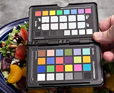
Color starts with the capture, of course, and one of the things you can do to improve the first step is to calibrate your camera. This is a simple process, and really does nothing in the camera itself. You photograph a target such as the XRite Passport and using their software you create a profile. This is used when you process the raw image as the profile is in your computer. Much like a monitor profile, the color is "corrected" to match known initial source colors of the target so that they are reproduced more accurately. Provided the monitor is also calibrated, you should get an accurate representation of the original scene, or at least a more accurate rendering than you would without calibration.
Accurate color is more important to some photography than it is to others. Photographs of products should accurately represent the product. If the camera shifts certain colors away from accurate the processor will need to employ possibly complex masking to reign in the aberrant color. This was true with film as well and the fix then was an even more complex and expensive process. Today it can be a one click modification followed by minor tweaks rather than digital heroics. In non-critical images color shifts are often ignored if they are even recognized in the first place. Color shifts can even be introduced into the image to impart a mood or creative interpretation.
Color Temperature and Tint
Understanding color temperature and tint shift is important to start, but understanding capture that is not faithful to the original scene is entirely different. With digital capture you can choose an initial color balance in the camera settings or allow the camera to "auto white balance". This will set the colors in a camera processed jpg file. A raw file actually has no color balance until you impose it on the scene in the raw processor. With a target of known value the raw processor can with a single click render neutrals as neutral and other colors in the scene will be rendered in relation to the neutrals. This is usually the first step in getting to accurate color.
However, neutral is not always what is desired, or even what looks good. In many cases truly neutral grays in some images can seem to dilute the color. This is very true of portrait photography where a slightly warm bias to the image renders skin more appealing. This is not the same as product photography, this is interpretation of color for artistic purposes, not inaccurate representation of the subject.
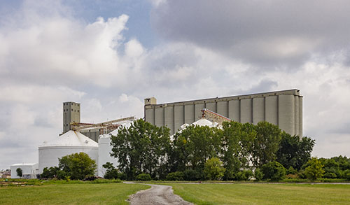
In the scene to the right the color appears to be correct as clouds appear near neutral and other recognizable colors are not distorted. However, the color balance has been shifted to make the white silos in the shade neutral, which raised the color temperature of the scene from 5500K (daylight) to 6800K and introduced a +33 tint shift toward magenta in order to remove the influences of blue light in shade and bounce light from the green grass surround. If you mouse over the image you will see the scene balanced to daylight. As your eyes become accustomed to the daylight version, shifting back to the first view shows you the magenta in the clouds which was not perceived initially. You may prefer one version over the other, or it may be that some compromise in between is more satisfying.
Color temperature and tint are two different things. Color temperature is the blue to yellow difference in the colors. Typical daylight is considered to be neutral at about 5500 degrees Kelvin. The sky is cyan/blue so its color temperature is very high, perhaps in excess of 8000 degrees Kelvin. Interior lighting with tungsten bulbs is yellow/orange by comparison to neutral balance. A warm interior light may be in the range of 2500-3400 degrees Kelvin. The numbers are not important except that you become accustomed to them as ranges of color. As the color temperature shifts even further, such as in candle light, the perception is more of red than yellow. In the full spectrum of visible light there is ultraviolet on the cool end and deep red on the warm end. It is easy to get confused when thinking of color temperature vs the color spectrum as the numbers appear to be reversed. Ultraviolet is at the low end near 400 nanometers, and the reds are at the top end at about 700 nanometers.
Primary colors are red, yellow, and blue. They cannot be created using other colors. In photography the three primary colors we deal with are red, green, and blue. This is seen in our processing as the RGB color channels of a typical image created by light. They are known as additive colors. The colors in CMYK are colors produced in printing and are colors created by inks and are known as subtractive colors. Neutrals are when the three RGB primaries are equal or very close to equal in value. Neutrals and primary colors are rarely pure and are influenced by shifts to cool or warm.
A tint shift is a variation in the green to magenta from neutral. Green shifts are often seen in reflected light from grass in natural light or in artificial light bulbs that are missing a significant portion of the magenta portion of the spectrum, such as fluorescent and some stadium lights. Magenta shifts are typical of sunrise images. As the primary color yellow is shifted to cooler (more blue) the tint shift is seen as green, and if warmer it is not more yellow, but more red, and appears as closer to orange. The primary red color shifts toward orange if warmed by added yellow, but is a pink tint if influenced by cooler bluish tones. The blue primary shifts toward cyan if more green, and toward magenta if more red. These are all shifts in the purity of the neutral tones and are referred to as tint shifts rather than changes in color temperature.
Your eyes are part of the problem. Our brains adapt to lighting variations using whatever neutrals or other visual clues are in the surroundings to let us see things as we expect to see them. Without that adaptation the colors of the world might be interesting, but in many cases would be disturbing. Food under fluorescent illumination would take on a greenish tint that would not be appealing, and the paper white of a book would not be the same everywhere, which is what we expect. The warm to cool relationships of interior and exterior light that we appreciate in some photographs would be omnipresent making color judgments of other materials impossible. Many materials change in color in daylight compared to tungsten or fluorescent light as the reflected color reacts to differences in the source illumination.
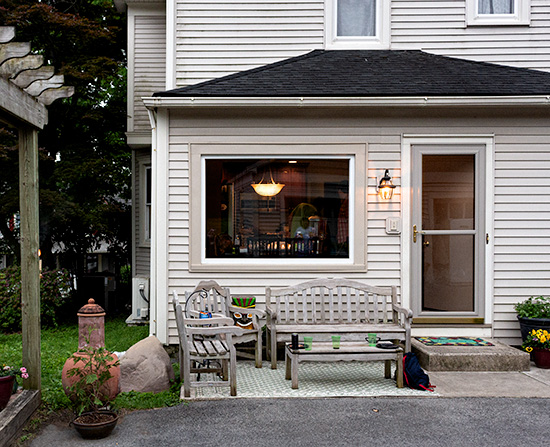
There are a lot of neutrals in this scene at dusk taken in soft light around sunset. The lighter tones in the trim and downspouts have been rendered as neutral. Some of the surrounding light grays are slightly warm, and only the roof and foreground driveway are slightly cool by comparison. Notice the yellow in the interior light and the illumination of the siding by the porch light. It is yellow by comparison to the established "white balance" of the neutrals in the primary light. White balance or the rendering of neutrals in an image can be dependent on the image content as seen in the industrial scene above and what part of the scene is chosen as the neutral point.
How different materials reflect color, which is how we see it, depends on the source illumination. Some color in our images depends on the relationship to other colors and depends on the established neutral balance of the image. The camera records the reflected color as a relationship, and the fact that we can reproduce something that resembles the original materials is something of an amazing feat to start with. As photographers we do not have to fully understand the physics of color to get a good image, but understanding that the camera does not necessarily hand us accurate color without some help is essential.
The first step in color correction is white balance. I white balance on something with a known or perceived neutral tone as this creates a perceptual neutral including removing a tint shift. Tint shifts can be more difficult to interpret than cool to warm shifts, so getting to a centered neutral is a good technique to get accustomed to. Once there, shifts in temperature (cool/blue to warm/yellow) can be done creatively without getting yourself into trouble with the possibility of a green to magenta shift. Done in the raw converter or Lightroom, the white balance tool removes the tint as an issue and sets the initial color balance in one click. Changing the temperature setting while in the raw converter gives you the creative control over color you may want without getting involved in numbers in Photoshop.
color spaces
Color spaces are the containers into which we put images to define what they look like. Files do not simply exist with a color, they exist with a set of numbers and how those numbers are translated into color depends on the display device and the related color space. One example of how this is usually described is a movie seen on multiple TV screens in a store. The color and contrast of the image depends on the setup of the TV set, and "messing with the controls" can change the appearance of the image of a particular set even as all of the sets receive the same picture.
Most cameras offer the option to capture in sRGB or Adobe RGB. sRGB is the most common color space, and the one we noted earlier as the space in which our monitor lives. Output devices like the color printers at labs are also sRGB, so they are in the same key. But, even as two trumpets need to be "tuned" to sound alike, the printer and the monitor function in the same color space, but still need to be tuned, or "profiled" to be compatible with each other, and make beautiful music, or output prints that match each other.
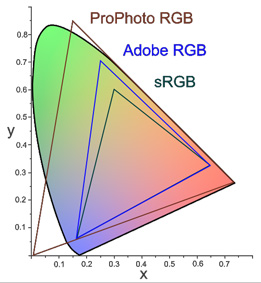
sRGB - A relatively small color space (gamut, or range of reproducible color), but recommended for most people who do not have a specific reason to work in a larger space. Casual shooters and portrait and wedding photographers working with outside labs typically work in sRGB. Working in a larger color space like Adobe RGB or ProPhoto and sending files to be printed in sRGB will result in dark, flat and desaturated colors as the expanded color range will be clipped off rather than used for printing. If you use a lab for your printing you should know what color space they prefer you to work in. The sRGB color space is usually safe.
AdobeRGB (1998) - a larger color space containing a wider gamut of color, and the space preferred by offset printers, and therefore used by most digital image editors and photographers whose output will be reproduced in print. Many cameras allow you to capture your images in the Adobe color space (jpgs) instead of sRGB. Most photo quality inkjet printers have a sufficient gamut or range of reproducible color to take advantage of the Adobe color space. It is therefore a good choice for those making their own prints with better desktop printers. Note that raw files do not have a specific color space until acted upon by the converter, where they are considered to be in the largest color space, ProPhoto.
ProPhoto - The largest color space generally accepted to include nearly all light visible to the eye. Raw files opened in Lightroom and the ACR Adobe raw converter are initially in a very wide gamut color space similar to proPhoto until the output file converts them as determined by the settings you choose. It is also natively a 16 bit color space capable of holding all the available information from a raw capture. This allows greater editing freedom without banding and other artifacts caused by clipping color.
Dealing with Color Management
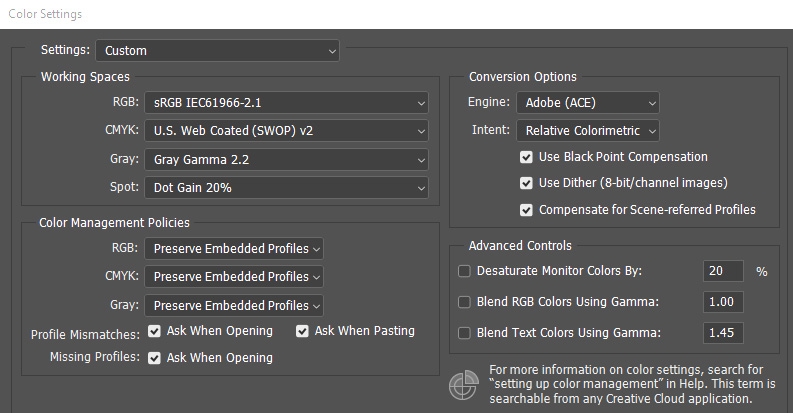
Color management is how you deal with the way an image travels from the source, through the editing, to output. Color management can be relatively hands off unless your output goes in more than one direction. Most people working with a digital camera may send images to a printer like Costco, and email images to their friends and family. Perhaps an image will end up on the web in a personal web gallery. All of these outputs can be dealt with within the sRGB color space. How well profiled your monitor is will determine how closely your images will match those of someone else with a profiled monitor. Without profiles all bets are off. If you can choose "auto off" in sending an image for print the result will more closely match your intentions. If it does not, your monitor is the issue, not the printer.
When you send images for outside printing you should check to see how the printer manages files. In the absence of more information, it is fairly safe to assume an sRGB color space. Some labs will "convert" incoming files to the space used by the printer. Others will not, and simply print what you send. If you send an AdobeRGB file to an sRGB printer that does not convert the print will likely be somewhat dull in color and possible flat in contrast. To what degree this happens is image dependent. If the colors in the file fall within the sRGB color space you may not notice a problem. But a richly colored, more saturated file like a flower shot or a sunset could be a real problem. People may tend to have grayish faces. This is somewhat counter-intuitive. You might expect a file with a greater range of color to print more vividly, but the reality of color management is that "out of gamut" colors are more often clipped off which results in the loss of color saturation. This is a simplistic explanation of the issue, but it is a reality to be dealt with. Many photographers recommend processing in AdobeRGB or ProPhotoRGB color spaces as the color spaces are larger and can accommodate more saturated colors. While true, this assumes that your monitor can display them in the first place, and output to a lesser color space must be properly managed.
Your goal is to have the neutral values, overall density, color and contrast appear pretty much the same everywhere. If things are really out of whack, you need to look for the flaw in your settings to see where you can make changes and get into line with everyone else. If you work in more than one color space, like Adobe for printing on a good desktop printer and sRGB for email and outside printing, you need to pay closer attention to making sure your files are in the proper space when they go out of the computer. Start in the larger space (Adobe) and make modified files in the smaller space (sRGB) as needed. If working in Prophoto you should work in 16 bit as well. When converting always convert "down" as converting up gets you nowhere. When converting down always convert the color space first, and then the bit depth if you are working in 16 bit. Always "convert to profile". Never assign a profile.