Image Shooting and Processing Hints
The key to learning how to make good images is to learn to see what they might be, not what they are. The photographer today has the tools with digital to work like a painter, including and excluding, modifying, colorizing, and creating the image that is in the mind. Don't let the hardware run the show. But first, you need to capture your source material in a way that gives you the most creative freedom.
Camera Settings
ISO - a camera's base ISO is not important. How the camera manages image quality and noise reduction is. To know that you need to test the camera. Without getting too technical about it you can do one thing rather easily. Shoot a scene that is fairly normal in contrast (the histogram fills most of the range without clipping on either end). Shoot it at one stop intervals in the ISO setting (100, 200, 400, etc.) varying the shutter speed to compensate so the exposure remains consistent. Open the raw files without changing the default settings and examine the files for noise in the darker areas of the capture. The first ISO setting that shows significant noise at 100% on screen would be my choice for the maximum usable ISO. Why settle for any noise? You can easily tame down moderate noise in processing and a lot of visible noise in screen will not print. Remember that at 100% on screen you are already looking at the image at about 3x magnification. Shooting at the lowest possible ISO in most cases gets you nothing but fewer choices for aperture and shutter speed. Don't let ISO rule the day.
"Ansel Adams, Richard Avedon, Robert Capa, Diane Arbus, and Henri Cartier-Bresson had a lot more trouble with grain than we have with noise." - Dan Margulis
Picture Style Settings - Set your camera's picture controls to help you get the best feedback from your preview screen in terms of the histogram and highlight warnings, not the best looking image unless you are strictly a jpg shooter. The Neutral setting is likely the best choice in most cameras as it does the least to process the images in camera. If you have further control over the settings in the Neutral option try lowering the sharpening and contrast settings to their lowest. Both sharpening and contrast enhancement in camera expands the image histogram and increases the chance that highlight warnings will be issued. This will lead you to tend toward underexposure. Since most camera meters tend to underexpose to protect jpg highlights, the result will be a raw file with about a one stop underexposure. If you do not manage your exposure manually and understand exactly what your camera is doing you will essentially be throwing away about half of the image data your sensor is capable of capturing and for no good reason.
Highlight Warnings - "Blinkies" are the camera's way of warning you of possible overexposure. But they can be used as a cheap and easy exposure check. While specular highlights (light sources) may blink forever no matter the exposure setting, normal areas of high value should not. If the white shirt, clouds, or other important bright areas of an image are flashing at you your exposure is too bright. Lower it until you see minimal blinking on the screen. Making it go away completely is not always necessary as your raw file will have a much greater range of capture than the jpg the camera is using to warn you. If you test this by comparing images where warning occurred on the camera screen to the raw histogram in the processor you can get to know where your parameters are and how to get the most from your exposure. In other words, how far can you push the envelope. This is often a faster method than playing with exposure compensation or making careful manual readings of the scene to set the exposure and will yield a perfectly usable exposure.
Shutter Speeds - You should get to know how shutter speeds affect your ability to shoot sharp images. The camera needs to capture the subject without blurring. So the camera movement relative to the subject is important. Trying to hand hold the camera steady is difficult and the longer the focal length the more difficult the challenge. Just breathing introduces camera movement along with other factors that can lead to unsharp images. If you are tracking a moving subject the same applies, and short exposure times are better. The background is not important, but you still need to capture the subject well. Longer exposure times are fine provided the camera is steady relative to the subject. A 125th of a second may sound short to you but it is more than enough time to get a blurred picture. For longer exposures a tripod or other camera support can help you improve image sharpness.
Aperture - Your f/stop determines the depth of field or area of perceived acceptable sharp focus in the image. This is a moving target as the distance to the subject, and the focal length of the lens factor in. You need to have an idea of what settings will provide you with acceptable images relative to the image you want to make. Shallow depth of field for some subjects is better if rendering the background as soft tones is desired. Flowers with limited depth of field look good. Landscape with greatly extended depth of field look good. Read the article on Aperture, Depth of Field and Diffraction for information on lens issues like diffraction caused by small apertures. Explore the depth of field calculator to understand how distance, focal length and other factors influence acceptable sharpness in your image.
Use the Histogram
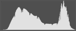
Histograms should not show vertical lines at either end of the histogram if possible. If the image will not fit within the histogram window without clipping at either end you have a high contrast subject and need to deal with that with multiple exposures and either exposure blending or HDR processing. A proper histogram will show little or no clipping at the right end depending on specular content. Shadow and other dark values should not show clipping on the left end, but do not have to extend completely to the left as that can be dealt with in initial raw processing without harm to the file.
Favoring exposure to the right of the histogram (ETTR - expose to the right) is a good idea. Providing you do not clip any highlights, brighter exposures provide you with more detail in the file. Darkening an image will not cause noise or sacrifice detail, but raising the exposure setting will. If you know exactly where you want to "place" an exposure, that is fine. Then check your histogram to see if that exposure placement creates any issues with either end of the exposure scale. "Proper" exposure isn't an issue, but underexposure should be avoided.
Camera Calibration
Another step in the right direction is actually calibrating the color in your camera. This is done with an X-Rite device called a ColorChecker Passport. This uses a set of known color values you photograph and a piece of software sets corrections for your camera's incorrect capture of color. An example of this is shown in my article on image neutrals on the Learning page.
The first steps you can take are easy. They involve editing the picture control/style/profile menu in your camera. These can affect the in-camera jpg processing and do nothing to the raw files. However, they influence how the histogram appears based on the jpg preview and that is what we want to control.
Choose something like Neutral that would make sense to you and lower the contrast and sharpness settings to their minimums. This will present you with a less contrasty jpg preview, but more importantly, a slightly more reliable histogram of the image for analysis. Contrast and sharpness will expand the black and white points in the jpg which will result in a histogram that will appear to show highlight and shadow clipping that is not likely to appear in the raw file. Since you want to be able to expose the raw file as far to the right of the histogram as possible without clipping, this will keep you from unintentional underexposure.
Monitor Calibration
In the absense of special calibration tools for setting color calibration I would suggest two things. First, lower the brightness setting on your monitor to about 100. It is likely more like 250 or higher out of the box. This will not make the image dull or gray, it simply keeps the image from appearing overly bright. Second, use some kind of target value to set a neutral in the monitor. There are several out there. I recommend the Lagom monitor calibration and testing page. Tests there for a variety of monitor settings are very useful. Most useful are the black level and white saturation tests which will show you how accurately you can envision tones in your files.
An overly bright monitor will lead you to darken your images more than necessary as you are compensating for the brightness, not dealing with real luminance values. With lower brightness values and a contrast setting that allows you to more accurately judge where high and low values appear accurately on your monitor your black and white point, sharpening, and other considerations will be better.
If you want to get more serious about calibration I recommend the Calibrite Display Pro HL Colorimeter at $279. You will not see a dramatic change in your monitor, except a noticeable reduction in the cool tone overall, but the colors in your file are being modified to match target values which will make all the colors more accurate. The process is overcoming the limitations of your monitor to reproduce color accurately, even if you are not aware of it. The primary benefit is that prints from your files will more closely match what you see on your monitor.
Color Management
Color management is how you deal with the way an image travels from the source, through the editing, to output. Color management can be relatively hands off unless your output goes in more than one direction. Most people working with a digital camera may send images to a printer like Costco, and email images to their friends and family. Perhaps an image will end up on the web in a personal web gallery. All of these outputs can be dealt with within the sRGB color space. How well profiled your monitor is will determine how closely your images will match those of someone else with a profiled monitor. Without profiles all bets are off. If you can choose "auto off" in sending an image for print the result will more closely match your intentions. If it does not, your monitor is the issue, not the printer.
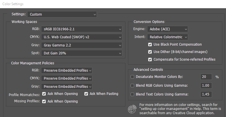
When setting up your Color Settings in Photoshop you can choose the RGB working space you will most likely work in. Another approach is to simply choose the sRGB working space as that is a safe space for your monitor. At the same time, preserving embedded profiles and asking when the image profiles do not match will allow you to import your images from ACR or LIghtroom in a larger color space simply by accepting the mismatch, which will override the sRGB setting. This also brings the color space of the image to your attention as you work. Notice in the setting example that the Gray space has been changed to Gray Gamma 2.2 from the dot gain default which is for offset printing. This will better represent your B&W images on your monitor.
When you send images for outside printing you should check to see how the printer manages files. In the absence of more information, it is fairly safe to assume an sRGB color space. Some labs will "convert" incoming files to the space used by the printer. Others will not, and simply print what you send. If you send an AdobeRGB file to an sRGB printer that does not convert the print will likely be somewhat dull in color and possible flat in contrast. To what degree this happens is image dependent. If the colors in the file fall within the sRGB color space you may not notice a problem. But a richly colored, more saturated file like a flower shot or a sunset could be a real problem. People may tend to have grayish faces. This is somewhat counter-intuitive. You might expect a file with a greater range of color to print more vividly, but the reality of color management is that "out of gamut" colors are more often clipped off which results in the loss of color saturation. This is a simplistic explanation of the issue, but it is a reality to be dealt with. Many photographers recommend processing in AdobeRGB or ProPhotoRGB color spaces as the color spaces are larger and can accommodate more saturated colors. While true, this assumes that your monitor can display them in the first place, and output to a lesser color space must be properly managed.
Your goal is to have the neutral values, overall density, color and contrast appear pretty much the same everywhere. If things are really out of whack, you need to look for the flaw in your settings to see where you can make changes and get into line with everyone else. If you work in more than one color space, like Adobe for printing on a good desktop printer and sRGB for email and outside printing, you need to pay closer attention to making sure your files are in the proper space when they go out of the computer. Start in the larger space (Adobe) and make modified files in the smaller space (sRGB) as needed. If working in Prophoto you should work in 16 bit as well. When converting always convert "down" as converting up gets you nowhere. When converting down always convert the color space first, and then the bit depth if you are working in 16 bit. Always "convert to profile". Never "assign" a profile unless you have imported an unmanaged image from the web in which case it should usually be assigned sRGB.
Taking things apart
One of the things I learned to do to make better decisions is to take the image apart and analyze the pieces. When processing the tendency is to look at the entire image and process it as a global unit. In Lightroom it can help to use the crop tool to isolate the primary subject area and make judgments independent of the entire image. You might consider virtual copies especially if you intend to edit in Photoshop. In ACR it is possible to process an image in more than one way and open multiple copies. Use the crop tool to make more localized decisions in various areas. Of course, you will remove the crop to open the file, just do your best to ignore the effect on the whole image as you work. The different versions can then be composited for the best result.