Image Neutrals
Setting the Foundation for Good Color
A color image usually needs a visual base that establishes the accuracy of the color. That is normally a neutral color balance against which the other colors in the image are compared and recognized as being correct. If the colors in the image that would be perceived as neutral, especially blacks and whites, are noticeably contaminated by a color cast the entire image will appear to be incorrect. The natural adaptation of the eye to varying light uses neutrals as the foundation. Therefore, it is best to establish the contrast and color balance of an image by first correcting the black and white point neutrals. This is easiest to do at the start, usually within the initial stages of raw conversion, and makes other needed color correction within a file easier to recognize and accomplish. With a neutral foundation the remaining colors in the image are easier to accept.
Most images will have a black point (the deepest shadow in the image) or they will appear to be lacking contrast. Because of the way the human eye perceives color, areas of very dark tone often seen as neutral unless they have a noticeable color cast. Cameras do not have this perceptive ability and simply capture what is there, or add their own biases. The resulting reproduction does not match what the human eye would naturally see so the image can appear incorrect. While profiling should minimize this, setting the black or low value neutral point the raw conversion or in Photoshop or Elements can go a long way to improving the color of most images.
Setting a black point does not mean making the lowest tone in the image zero in all three channels. A neutral dark gray is sufficient to establish a color reference. Any point already at zero in any channel is not a good target. In a gray scale of tonal values anything below 10-12 (or higher with certain papers) should be considered black absent a specific consideration for an output device. Numbers can and will go lower than that, but it is not necessary to artificially drive them down to lower values as that will simply drag other dark values down, possibly minimizing detail. Knowing how the image will be used, or reproduced will influence how the values need to be addressed. In most cases the three channels can be simply equalized at the value of the lowest channel that is not zero, and adjusting the composite to meet the demands of the output device. This is because the reproduction of the image on a monitor, or printed by any particular printer on any particular paper will have a different black point and transition to dark grays that needs to be considered. Note also that sharpening tends to lower the black point.
Aim Points and Sharpening
Most images have a high neutral value, but a pure white point requires that an image have a specular highlight. A specular highlight is a light source or reflection of a light source. This will be perceived to be the brightest point in the image as nothing could be brighter. Therefore, when printed, the specular would be represented by paper white. Most realistic images have bright whites short of pure white that can be set as neutrals. Speculars can not be used as neutral targets as you cannot be sure at what point any channel has clipped compared to the others. The trick in processing a raw file is to target the brightest printable high values when dealing with the whites slider rather than to simply preventing clipping.
Black and white point corrections are most easily accomplished using Levels. I often do this simply to distinguish between setting neutrals and color corrections set in Curves. The input endpoints immediately under the histogram are moved in each channel to achieve an aim point within the image. This distributes the correction in a decreasing percentage toward the mid-tones so that the modifications are gradual and even. Setting dark and light neutrals has the effect of cleaning up the color in an image. Use the Threshold adjustment layer to discover the darkest and lightest points in the image and help you decide where to make your decisions, and then discard the Threshold layer. Be prepared to choose an alternative point in the image should your initial decision result in a less than satisfactory correction. Some images with strong colors moving into dark areas can be problematic and knowing how your output device handles these tones will influence your decisions. There are no absolutes, merely guidelines, and the resulting image is always most important.
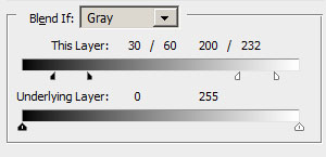
A critical point must be made here relative to image sharpening. Sharpening techniques expand the contrast of edge values within the image to create the illusion of sharpening. Saving a file as a jpg also can enhance the contrast of an image and push black and white values apart. It is common to notice white values clipping with sharpening and file conversion so this must be considered in the image making process. Black values will also change but are usually less obvious. One solution for Photoshop users is to attenuate the sharpening layer using the BlendIf sliders to protect the top and bottom values in the image. This is not complicated to do once you are used to the technique. This example shows values below 30 and above 232 being protected, mid-tone values from 60 to 200 being fully sharpened, and transition areas from 30 to 60 and 200 to 232. Sharpening is then restricted to the mid-tones. The actual values for an image will vary based on the image content. This will work for sharpening layers but cannot be applied to jpg conversion, so you need to be aware of any unwanted shifts in contrast when converting files.
Sharpening with Smart Sharpen is a valuable technique as the filter incorporates the equivalent of BlendIf sliders in the dialog in an easily understood set of sliders. After setting the sharpening parameters you can restrict the effect to the midtones where they are most effective by attenuating the effect on the highlights and shadows independently and with excellent control options. This makes Smart Sharpen a favorite sharpening tool for many. Even using Smart Sharpen you should remember that painting the results into the image with masking is an alternative to be considered. I have an article on the Smart Sharpen Filter here.
Midtone Neutrals and Color Temperature Shifts
Mid-tone neutrals are often harder to find a target for, and setting the white balance of the overall image in the raw converter will settle that issue well enough. In an already processed file if you know you have a neutral area or target, simply match the RGB numbers in that area regardless of value as anything with equal RGB numbers is neutral by default. The only decision is which channel to use as the set point. Usually the green is a good decision, and curves is a better tool to use as you can target values other than the mid-point for correction.
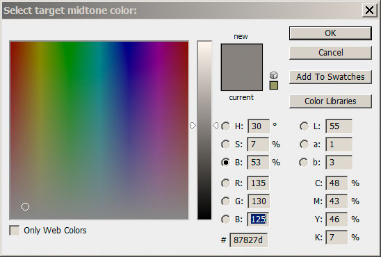
The neutral eyedropper in Levels can be adjusted to impart something other than neutral such as a slight warm or cool cast. That can be used to manage consistent color changes to a midtone neutral or match colors from one image to another. Values within 5 points of each other, usually with the green channel centered between the red and blue values, appear comfortably neutral. Strictly matching the numbers precisely is not usually necessary.
In the example on the right the red channel is 5 points higher and the blue channel 5 points lower than the green channel. This will create a "warm" neutral appearance. A color temperature shift is where the RGB channels spread slightly with the red and blue channels moving equally away from the green channel. Where 140 in all three channels may be the accurate neutral color numbers, 145/140/135 might be a desirable, slightly warm neutral alternative, or even 150/140/130. How far to go is your decision. To avoid shifting the black and white aim points apply BlendIf to protect the ends or lock high and low values with points on the curves to minimize or eliminate the shift.
Some images look better when the neutral values are not strictly neutral. Often mid-tone values where a slight warming or cooling of the values imparts a desired color shift to the image are more appealing. Neutral black and white point values in those cases usually help make the shift in the mid-tones appear more intentional and accurate rather than looking like an error. Warmer skin tones are more appealing than tones that result from strict neutral interpretations of mid-tone values. It is the end points that set the stage for visual comparison.
Tint Shift
A tint shift is where the green channel value is not centered or close to centered between the red and blue channels in a neutral value and may be seen as a mistake. Where a temperature shift (warm/cool) is common to achieve a desired appearance, a tint shift imparts a green or magenta cast to the mid-tone values rather than a warm or cool appearance. This is similar to the Tint slider you will see in the raw converter basic panel for color correction. It is common to see slight magenta (low green) casts in many images, often in skin tones. Intentional color casts may include such shifts, however, and a sunset with high magenta values will certainly be more acceptable than one where the color has been neutralized and therefore the visual impact diminished. That would be a case where the foundation black neutrals may be very important to prove that the mid tone tint shift is intentional and desired. If the magenta tint would bleed heavily into the deep blacks it could be seen as a processing error instead. Occasionally a color shift in the black and/or white points of an image can be seen as desirable depending on how "realistic" the intention of the image. This goes to what is known as "color grading" where the appearance of the image is intentionally shifted for effect. A current common color grading effect is cool (cyan) shadows and warm (orange) highlights. This is seen in movies and fashion photography.
White Balance
Technically, the process is setting a neutral balance based on the fact that a neutral target is the same value in all three color channels (RGB). This can be done with a custom white balance in the camera, but with raw files it is more easily done in processing the file. The camera can be set on "auto white balance" as that will only affect the jpg files and preview. You can also choose various preset source colors such as daylight, and tungsten, or a specific Kelvin temperature.
In processing the raw file in ACR or Lightroom you can set the neutral point with a single click using eyedroppers and change your neutral point at will until you see what you want. You can also choose those same Daylight, Tungsten and other presets to see if they render the image well, but a good target is the better idea. That can be something within the image or a device for the purpose.
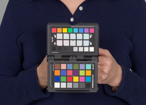
An accurate reference target will guarantee you the best possible color. I suggest the X-Rite Passport as a good solution to the issue as it will provide both good white balance targets and fully profile the camera for accurate color rendering under almost any light source. You can't beat a profiled camera for accurate color and in conjunction with an accurate white balance most of your color issues are effectively eliminated. A less expensive alternative is the Whi_Bal neutral reference card which is a good choice for a color reference but does not allow you to make a camera profile. I prefer reflective targets to the lens cap style or filter like methods.
Roll over the image to the right to see the original capture without the camera profile correction. The improvements in the blues in particular is very noticeable, but the entire row at the top shifts to one degree or another. The subtle changes in the various color chips in the target represent changing the captured color tones to the "accurate" color tones based on the target. This is not arbitrary, but rather based upon recognized industry standards. This is profiling the camera and will improve your overall color and diminish necessary local correction in post production.
White shirts and white paper may appear as white as a patch on the X-Rite Passport, but with one important difference - white comes in flavors. Shirts and paper are not a known source, but can have excessive amounts of ultra-violet light reflecting from them. They may also be less than accurate in color balance, yielding a different yellow/blue balance than a source designed specifically for this purpose. Therefore, the results from fabrics and papers may be less than satisfactory under many light sources depending on the spectral characteristics of the light. A target simply makes the process easier and more consistent.
Workflow
Using the White Balance Eyedropper Tool you click on a neutral target in the image and the software does the heavy lifting. This should be done after removing any clipping from the image. Then if a custom profile is available I use that, or for an image where the visual impression of the image is more important than an accurate representation, cycling through the profiles that came with the camera is an appropriate technique. Do not just pick the one that provides the most intense color, but try to decide what appearance you intend to make of the image and choose the profile that matches your concept. Profiles can exaggerate some colors over others and the right profile choice will help you get closer to your result without more work later in the process. After the profile is chosen, double check the white balance as it may have changed slightly. A white balance target value for me is generally a high value neutral well below clipping, perhaps something between 200 and 240.
With the white balance set we have eliminated tint shifts due to the lighting from the image. This means we have a technically accurate image, but not necessarily what we want to see. We can modify the color temperature to improve the skin tones in a portrait, or otherwise warm or cool the overall image to suit our intentions. Further modifications may be made in to local areas using Photoshop, but the basic white balance in the raw image is an important first step.
If you are shooting Jpg images or dealing with an imported image from a scanner or other source, you need to deal with white balance in a different way. Once I have opened an image in Photoshop I essentially start the process over again. First I set the lowest dark areas of the image that do not require detail. In raw images I keep my contrast a little low and my black point a little shy of where I want it to ultimately land. Sharpening, output and other factors influence the needed black point so I leave myself room for adjustments. Any fine tuning is easily done at the end, but raising points that are too low is not the best idea. With the image open in Photoshop, the neutral base for my image is the starting point.
Visual decision making assumes that you have a profiled monitor capable of showing you accurate color and contrast or you are asking for trouble later in the process. A quality monitor capable of being profiled is essential. Most monitors are cool rather than neutral, and often way too bright for image editing. Once profiled and tamed they are easier to work with and also are less of a strain on the eyes over long periods. Accepting the color on your monitor as being accurate is not a good idea unless you have taken steps to be sure that it is.
It is an important part of learning to process digital images that you have good reference images to compare to your own. Learning what a good, color cast free, appropriately processed image looks like will allow you over time to more easily recognize problems on the screen. Initially, you can use target numbers to help you get an image reigned in, but the creative side of imaging requires going beyond the numbers to making informed visual decisions. Most photographers will just not go that far. Professional photographers certainly should and serious makers of fine art images will quickly realize the value in better processed images. The visual impact and refinement of vision that is apparent in a well processed image can be easily seen by the more sophisticated viewer. Understanding the role that a neutral color base plays in image making will help you get a better result, and get it more easily.