Lightroom Overview - Part VII
Lens Corrections
Under Lens Corrections in the develop module you will see two tabs. The manual tab allows you to correct barrel and pincushion distortion to the image caused by lens issues. The Defringe area controls color fringing at edges if the color channels do not align properly, another issue created by a poor lens. And, at the bottom you can correct for vignetting, usually corner darkening caused by light falloff as a lens issue.
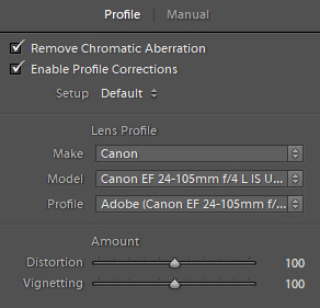
The other tab is Profile and if your lens is in the database (most are) these issues can be corrected automatically by Lightroom. The two checkboxes at the top, "Remove Chromatic Aberration", and "Enable Profile Corrections" are off by default. They should be on, so you should check both boxes. It is a very rare occasion when these are a problem rather than a solution. Below the lens profile information are two sliders which allow you to fine tune the distortion and vignetting should it be necessary. They are centered at 100%. I have never used these adjustments.
You will want these changes to the Profile to be the default so that every image you import and develop get the corrections without you having to check the boxes every time. To do so open a new raw file with no corrections and navigate to the Lens Corrections | Profile dialog and check the boxes. Under the boxes there is a "Setup" drop down that says "Default" . Use the arrows to the right to see "Save New Lens Profile Defaults", and click on that to make the changes.
Transform
Transform is a correction area that is ignored by too many photographers. It can fix perspective issues with an image where you may have had the camera tilted up or down, or otherwise not properly leveled. There are six buttons in the top section. In the top row, Off obviously turns off any corrections. Auto will attempt to make corrections to the image by analyzing the luminosity structure and attempts to find vertical and/or horizontal lines it thinks should be corrected. The Guided button allows you to draw two or more lines on the image as a reference for how you want corrections made. It is the most accurate way to correct architectural images and is quick and simple. This is the same as the Guided Upright tool icon in the upper left corner which can also be activated with Shift+T.
The bottom row of button includes Level which attempts to level the image horizon or horizontal lines in the image. The Vertical buttom does the same thing with vertical lines such as building structures, bridges, and even trees in a landscape. The Full button attempts to impose leveling, and horizontal and vertical corrections. Depending on the image any of these "corrections" can be rather amusing. If a structure has an intentional perspective like train tracks receding or a structure at an angle the Full button can create rather bizarre results. Auto is better, but the Guided Upright is the best option. If you simply need to level an image the Straighten tool in the Crop dialog is easier.
Effects
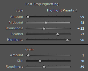
The Effects dialog should be ignored if you are intending to send an image to Photoshop as your controls there will be more powerful. Otherwise, the Post Crop Vignette controls are pretty good. The vignette is imposed symmetrically on the image and respects any cropping you did to the original. I show the settings here with the style set to Highlight Priority as this will attempt to avoid graying down lighter tones at the corners and edges as the vignette is applied. This is a good choice for B&W images. Color Priority attempts to minimize color shifts that might occur with the vignetting and is a better choice for color images. Paint Overlay simply applies black as a vignette. I also show the Amount setting at the far left which is how I recommend you start the process as this imposes a very noticeable vignette which allows you to better see the results of the other settings. It could also be set to the far right if your intention is to impose a light vignette. This would then be backed off to a lower value to generate the desired vignette.
The Midpoint slider controls the degree to which the vignette travels into the image center. The Roundness slider controls the shape of the vignette which can be more easily seen with the Feather set to a low amount. Higher feather settings then blend the vignette into the image more gradually. Vignette can be used in two ways. A subtle edge and corner vignette can help pull the eye into the image and should be felt more than seen. Stronger vignettes impose a style on the image which is popular in some portrait images, but may also work on other images as well. It is a visual effect and up to you. The Highlights slider adjusts the degree to which the highlights are protected from the vignetting except in the Paint Overlay mode.
Calibration
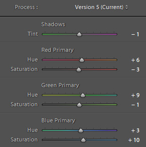
The Calibration panel affects the version of Lightroom process applied to the image, which by default is the current version. If you are processing an image that was previously processed in an older version and the newer version for some reason has negative effect you can choose an earlier process version here and preserve your original intentions. This is pretty rare.
The Shadows tint slider is primarily intended to remove unwanted tints in the shadows of an image. If you have managed this with color balance and good camera profiles this will be irrelevant. It can be a strong shift and obviously adds green or magenta to the lower tones.
The Red, Green, and Blue Primary sliders affect the hue and saturation of the three primary colors used to render every color in the image. Every color is a mix of all three channels. The way these change image color is different than how HSL sliders do. In HSL the colors are interpreted as we perceive them visually, so changes to reds would primarily change reds and perhaps some oranges. In Calibration the changes are made to the way the whole red spectrum is rendered in the image. This means that changes in any channel will affect other colors in the image to the degree that channel influenced the creation of that color. Look at the percentages of RGB in any color to see how it is created and then you can better understand how a change in one would influence the others. An increase in red saturation might change the intensity of greens in trees. This is an area that is not intuitive, but can be very powerful. It actually modifies the manner in which the color profile of your camera capture is rendered in Lightroom. That is why it is called Calibration. At the same time, it is best left alone unless you know what you are doing.