Lightroom Overview - Part V
Tone Curves
Immediately under the Basic section is the Tone Curve tab. Essentially the same as a Photoshop curve, modifications to the curve will brighten or darken areas of the image. The default RGB which affects all channels can be changed to affect individual RGB channels which then affect color as well. Options are the default Linear (straight line) or Medium Contrast or Strong Contrast which simply introduce S shaped curves to enhance image contrast.
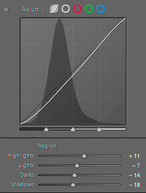
The displayed dialog shows the alternative Region curve which is accessed by clicking on the curve icon at the left. This dialog breaks the curve into four regions with sliders. This is easier to deal with in learning how curves work as the changes are dynamic and each area being changed illuminates as you move the sliders. However, this is RGB and cannot be managed in individual color channels as the Point Curve dialog allows. The Region section is therefore aimed at adjusting overall image contrast rather than color as it does work on the luminosity.
Note the three triangles at the quarter points at the bottom of the curve display. They can be shifted in order to modify the regions affected by the four divisions. In either curve option any custom curve can be saved if you wish to apply it easily to another image or save it as a preset modification.
I encourage Lightroom users to use the Tone Curve section to accustom themselves to the curves concept as the technique is very valuable in the event you move images to Photoshop. The curves adjustments in Photoshop are among the most powerful controls you have over color and density in an image. Many of the other dialogs introduced over time in Photoshop and Lightroom are similar in their effect on the image but are presented to the user in different forms. Even hue and saturation can be modified with Curves. Add blend modes to the tool and you have a very powerful means of controlling your images. Changing the blend mode to luminosity, for example, allows you to change the brightness and/or contrast of the image without shifting the color.
HSL and Color
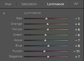
The HSL (Hue, Saturation and Luminance) and Color tab show two different ways to represent the same modification options. The dialog at the right is the HSL option and shows the sliders for all the different color ranges with the option to change the Luminance values of each. Clicking on the Saturation or Hue tabs gives you control over those alternatives. The Color dialog alternative allows to you to choose a specific color range instead and then offers the HSL sliders for that color. Choosing the "all" color wheel in the color dialog opens all of the color options at once on the screen with three sliders in each. Which dialog you might prefer to work in is a personal choice and may depend on what you intend to manipulate in any particular image. The sliders all do the same thing and are simply presented to you in different forms.
Color Grading
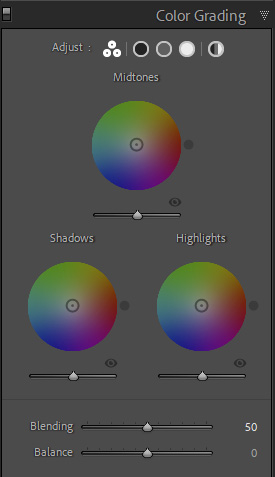
The Split Toning tab has been replaced with the Color Grading tab which allows you even greater control over the introduction of color toning. There are now three controls for introducing color to your images adding a midtone option to the shadow and highlight options. In addition, there are more controls over how the tones are applied to the image.
Part of the reason for the change is the increased popularity for adding Color Grading to images in the manner typical of the motion picture industry. Some of this has been possible in Photoshop using Color Lookup Tables but those options are limited if you do not understand how to manufacture custom LUTs. The introduction of Color Grading to Lightroom and ACR means a much greater level of control and more possibilities for creative modification of image tonalities.
You can still apply the split toning effect to B&W images if you simply ignore the Midtones control and apply changes to just the Shadows and Highlights. But the Color Grading options also allow you to make brightness changes to the area as well. All three controls show you color wheels to assist you in determining the colors to be modified. If you look at each area in detail you have sliders that show the hue and saturation as well as the new Luminance control. This can be valuable in fine tuning the values for printing. The Blending slider offers a greater level of control in how the toning blends with the original image tones. Defaulting to 50%, the effect of the toning can be increased or decreased to have a more subtle influence over the color values.
There is an eyeball icon at the bottom right of each control so you can temporarily mute that single control to see how it is affecting the image. There is also a color patch at the lower left in the individual controls that allows you to choose colors from the image itself or a selection of custom colors. A global option allows you to essentially overlay a color tone to the entire image. In this regard the Color Grading options allow a great deal of control over the image color and tone whether you are applying it to a B&W image or to a color image.