Light
Photography is graphics by light. Light can be natural or artificial, ambient or created. How we see light, and how we use it to generate our images is how we learn to be photographers. Light comes in color, direction, quantity and quality and reveals the subject of our images to the sensor we use to capture it. We can simply capture light, or we can manipulate it to suit our needs. We can shape it, mold it, and modify it, but mostly we simply use what we see and capture the effect it has on our images.
Angle

Light from off axis but less than 90 degrees from camera creates form and reveals texture. Light and shadow together shape the subject and create the illusion of three dimensions in two dimensional spaces like painting and photography. The lighting angle relative to the subject creates the lighting style in portraits, emulating the way natural light plays on the surface of the subject. On other subject matter it serves to create three dimensional form, reveal texture, and separate the subject from the background. This is what is referred to as the key light, or main light. As we typically emulate nature in our art, we subscribe to the convention that there is a singular primary light source.
Light from more than 90 degrees from camera can gain in brightness in the same way that light off of a road appears brighter driving into the sun than away from it. It is a function of the surface acting much like a mirror reflecting the source light in a more specular manner into the lens.
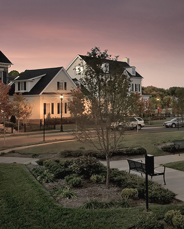
In the image at the right the light is from the right at slightly less than 90 degrees from the lens. The primary effect of the angle of the light is seen in the trash barrel and the stone work behind it. The barrel is revealed as round by the changing values of light reflected from the slatted surfaces. The light also reveals texture on the stone work in the structure behind the barrel. The light quality here is hard light which creates noticeable highlights and shadows revealing form and creating contrast.
Flat artificial light from the camera is generally referred to as fill light as its primary function is often to control the overall contrast of the scene and fill in shadow detail. By itself it is usually a less interesting light. If the only light it can be harsh such as direct flash often is. It can be from a hard or soft source but generally if used as fill it should be of such quality as to be of little influence on the character of the image. It plays a supporting role in that it is useful while not commanding attention. It differs from ambient light in that it does not pervade the space or have a distinctive influence on the image by its direction or quality.
Quality
Light quality is usually defined as hard or soft, but this is misleadingly simplistic. Hard or soft depends on the relationship between the light source and the subject. A small source very close to the subject may in fact be soft relative to the subject if it is physically larger than the subject as may be true in macro photography. A light source becomes harder as the distance from the subject increases as its relative size decreases in relation to the subject. Therefore, to make an artificial light source appear softer you need to move it closer to the subject if you cannot make it larger. This is common practice in portrait photography, and in product illustration.
Specular or diffused: A specular light source is one that creates a crisp shadow and reveals maximum textural detail. Specular sources are very small relative to the subject and well defined. The transfer of light to shadow in a specular source is sharp and fast, creating contrast and defined edges. Diffused sources create less well defined shadow edges and are large relative to the subject. The transfer of light to shadow in a diffused source is smooth and broad. Contrast is generally perceived as lower than from a specular source.
The subject itself can influence the perception of the quality of the light source. A shiny object will reveal the light source shape even if the source itself is large and diffused. A soft or textured object may diffuse the light from a specular source by scattering the reflection and hiding the shape of the source. The source character is then defined by the transfer of light at the edges of shadows.
Color
Color is measured on a two axis scale; temperature and tint. Color temperature is measured in degrees Kelvin where higher numbers represent cooler (more blue) temperatures and lower numbers represent warmer (more yellow) temperatures. Average daylight is approximately 5600 degrees K (Kelvin).
We perceive color temperature differently than cameras and other devices as our eyes and brain are adaptive. We use apparent neutrals in a scene to adapt our perception of color to the surroundings and the ambient light. Cameras and other devices must use a setting to determine the basis for determining color. The color of a subject then becomes relative to that base setting. If we use daylight as the base line for determining color then light from sources higher in temperature will appear more blue, and sources with lower values will appear more yellow. Common evidence of this in images is the cooler rendering of subjects in open shade where the blue sky dominates as a light source, or interior tungsten lighting where we see the golden glow of warm lighting.
Tint is the other axis and represents a departure from neutral toward either green or magenta. Light sources such as fluorescent tubes are missing a portion of the full color spectrum and subjects illuminated by them appear with a green tint. The color temperature may be correct, but the appearance of the subject is not seen as accurate. The missing portion of the spectrum, in this case magenta, results in the perception of the color as being green. Again, the adaptive nature of the brain allows us to function in areas without full spectrum light and still perceive neutral. Other colors may not be perceived accurately, however, and only in full spectrum light can accurate color be determined. The camera reveals this tint shift more acutely than we do. With our eyes it is usually only noticed in contrast to another source we are adapted to as neutral. It can be seen rather obviously in images and movies where an area is illuminated with fluorescent light and the primary neutral balance in the scene is daylight or tungsten.
In raw color files from a digital camera color can be modified according to our wishes. Choosing predetermined source values such as daylight or shade most often results in at least a pleasant rendering of the subject. However, using the white balance tool is the way to more accurately determine a neutral starting point as it eliminates the tint as an issue. With that resolved, we can then manipulate the color temperature to suit our preferences. Some subject matter appears more realistic when tints are present and acceptable. Sunrise and sunset are prime examples of times when the color spectrum is distorted by the atmosphere and we see those distortions as pleasant.
Saturation
Color saturation is the intensity of the color. Rich, vibrant colors are appealing and in an image tend to draw the eye. In that respect, middle values are more pure in color as the introduction of either black or white dilute the color and move them toward neutral. This is easily seen in Photoshop in the Hue and Saturation dialog where the brightness slider increases or decreases the value by adding white or black and the image color can be seen to lessen in intensity. At the same time, subject color often appears more saturated in darker tones than lighter ones, probably as the perception of density increases with the saturation. As the colors continue to deepen the saturation then begins to decrease.
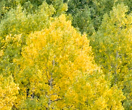
Care should be taken to avoid over-saturation of colors in an image. In the image of the trees an increase in saturation beyond a certain point begins to blend the oranges into the yellows diminishing detail in the leaves. The increase in yellow saturation also has a negative effect on the surrounding greens reducing the color contrast between the greens and the yellows. The image looks intense on a monitor, but checking the gamut warning in the view menu in Photoshop we see that a printed image will be outside of the range of the printer and the print will suffer from the over-saturation.
While saturated color is not a problem itself, over-saturation can obscure detail. Essentially, the color can overwhelm the detail and result in a reduction in apparent detail. Since the structure of the image is the same as the color in terms of the content of the pixels, heavily saturated color can tend to hide the structural information in the image. In a digital image this can also be simply too much black, evidenced if dark neutral areas are being lowered more than necessary. This would result in the lowering of overall brightness, and a loss of shadow detail. An excess of color values at any point in an image can similarly affect the image clarity. If you watch carefully you can see the point in a heavily saturated image where the color begins to "bloom" resulting in the color having the potential to overwhelm the image structure. Strong colors can be appealing if they do not overly influence the image in a negative manner.
True Reflective Value
The true reflective value or real color and density of an object is subjective. In determining accurate color in reflective materials a full spectrum light source with a high color rendering index (emulating daylight) must be used. Otherwise, shifts may appear in some colors based on their ability to accurately reflect the spectrum of the light source. In digital cameras a custom profile can be used to ensure more accurate color rendering. Absent a custom profile an image created by a camera or other device may shift certain colors or color values based on the accuracy of the sensor to reflect true color values. As we tend to view life as a relative set of circumstances rather than an absolute set of values we can easily accept moderate inaccuracies in the rendering of many subjects. It is when the true reflective value of a subject must be reflected in an image that the issue arises. Art restoration, fabric colors and paints are examples of subjects where accuracy is paramount.
Deviation from color accuracy is sometimes referred to as metameric failure. This occurs when the color of a subject appears to be different under different light sources. This is often a problem with certain printing inks and dyes. Inaccuracy of color rendering produced by inaccurate rendering by a digital sensor is not the same a metameric failure. In the case of the sensor failing to properly render the color it is usually possible to manipulate the color using a profile to correct the error.
Color inaccuracies in printed material are different as we are no longer dealing with only light as a source. We are now dealing with the reflected light from dyes or pigments, and often with the accuracy of the color of the dyes and pigments themselves. The presence of optical brightening agents (OBAs) in some papers can also shift color. Given the degree to which printed material can fail it is somewhat amazing that we can create reflective material that is reasonably accurate at all. We are dealing with reflective materials and the light source together to render color. It is often difficult to even see deviations from accurate color without a reference value for comparison. Within the image itself a foundation for neutral values will influence how the image is perceived as the eye will accommodate based on the overall color. This is why printers and others who have to deal with color accuracy use special light sources and neutral references as aids to determining the validity of the product they are producing. It is essential to be able to compare the printed rendering to the original subject under identical conditions.
Digital Photography
In digital photography this translates to reigning in the hardware we use through the use of custom profiles. Profiling our equipment is essential to color accuracy, especially if we intend to view an image in any arena other than where it was created. As soon as the image is taken from the camera into a computer we are dealing with a different visual representation. This means the monitor must be calibrated and profiled to accurately represent the image as defined by the numbers in the file. Even those numbers care vary as the image can be represented by different color spaces which can vary in their ability to encompass visible light.